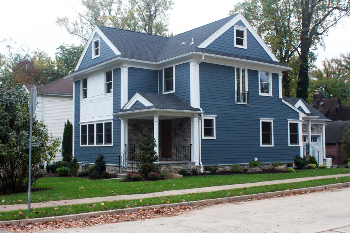
A Very Versatile Color
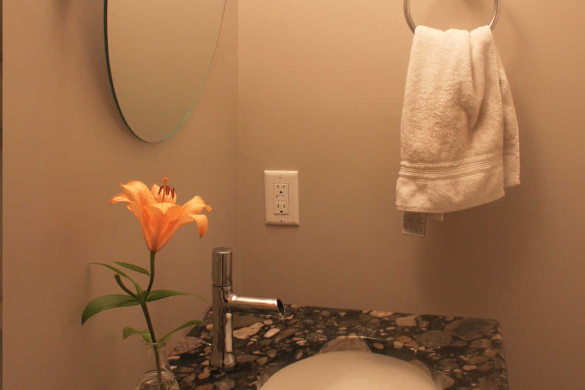
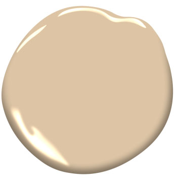
I recently was called by a client who wanted to paint her entrance hall, stairway, and upper hall. It was a center hall Colonial house that didn't get much natural light. On either side at the entrance were the living and dining rooms. It had been painted years before in an off white yellowish color that was not very inviting and looked blah. The living room had a subtle wallpaper on the walls in a pale pale green color. The dining room was a deep gold color. The carpeting on the stairs [...]